

Building a Brand That Reflects Purpose and Possibility
Licenced UK needed a brand that reflected the quality of their training while remaining accessible to a wide audience. Their existing identity lacked clarity and consistency, making it harder for potential customers to quickly understand what they offered and why it mattered.
In a competitive training market, this created a risk of being overlooked.

We started by defining a clear brand direction, focusing on how Licenced UK should present itself to build both trust and approachability.
From there, we developed a full identity system including:
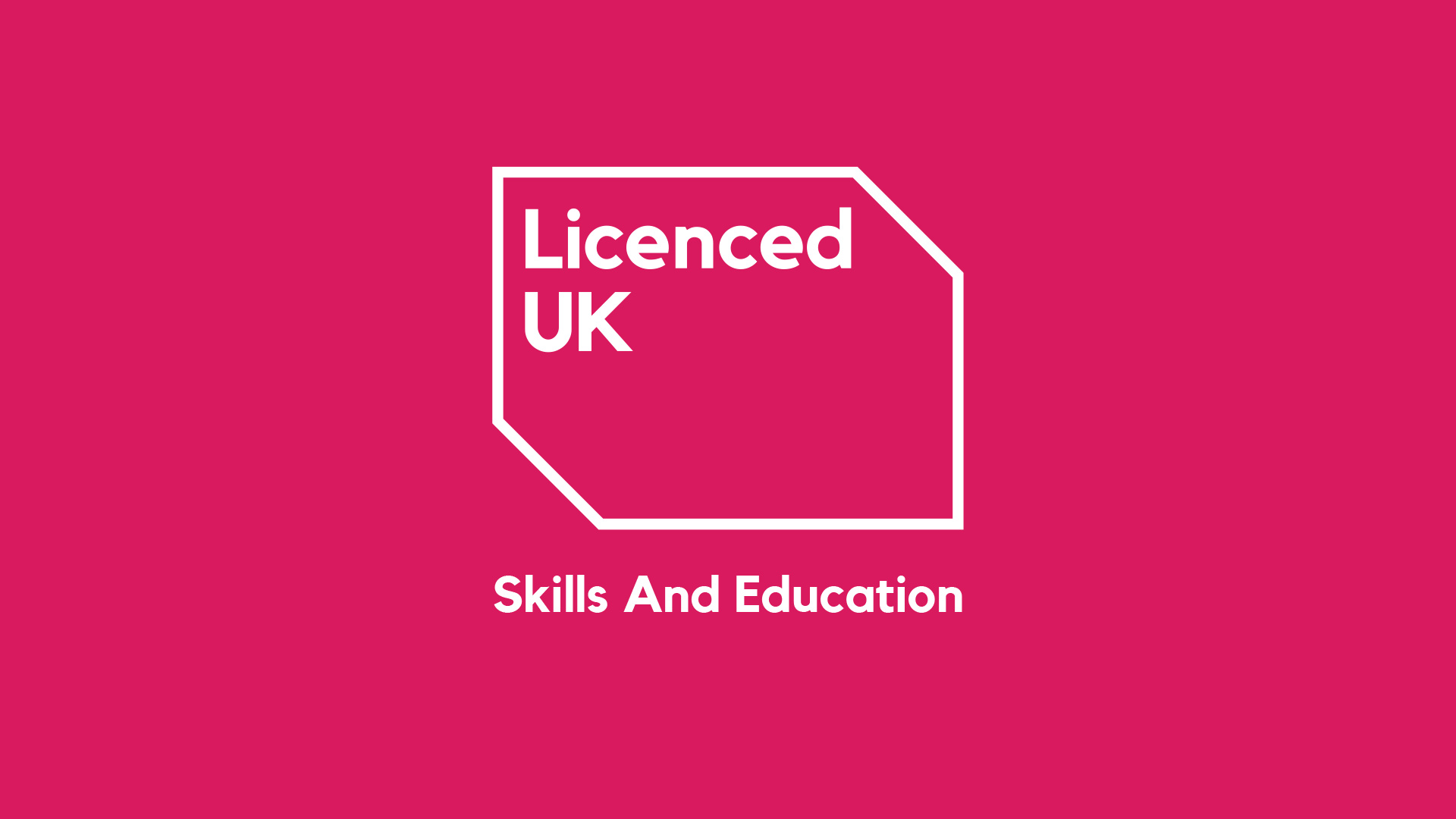
• Logo design
• Typography and colour system
• Communication style and visual language.
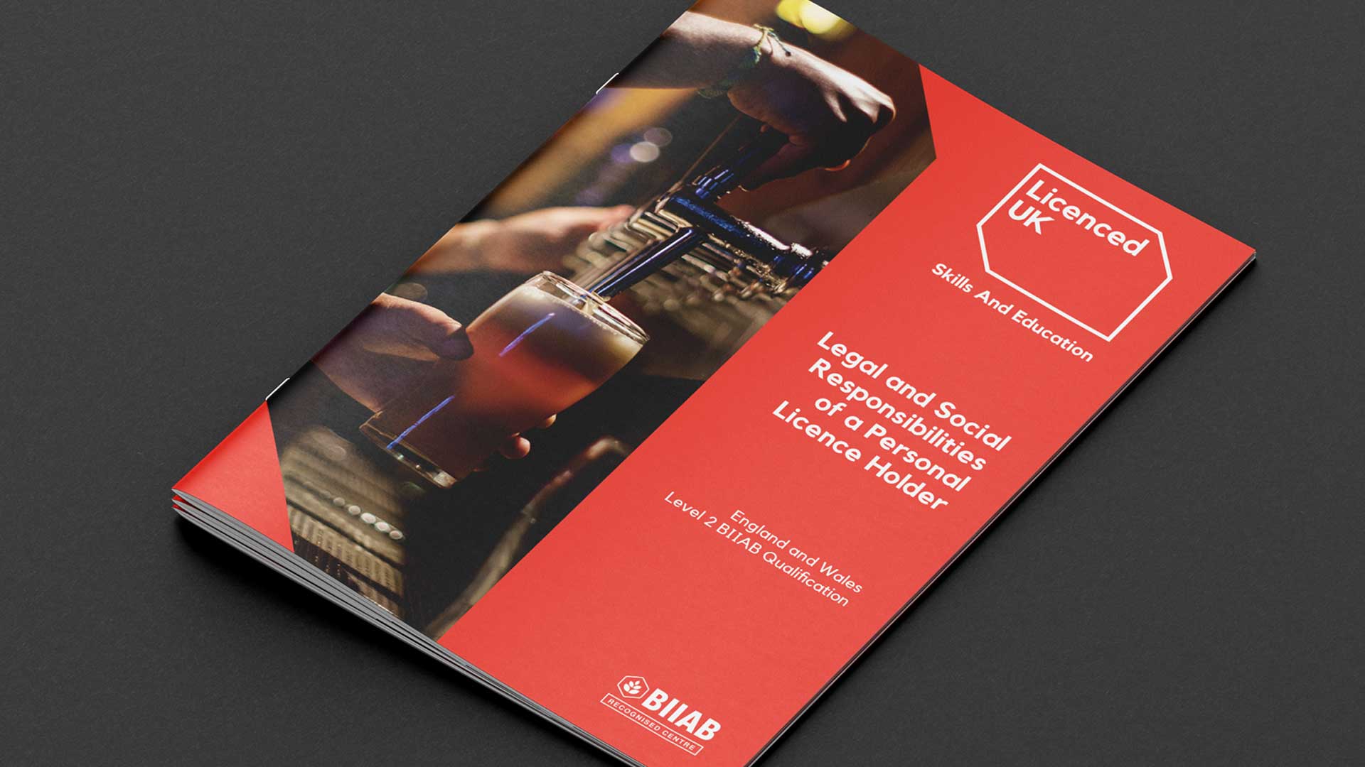
Every element was designed to remove confusion, improve clarity and support consistent communication across all touchpoints.


The result is a confident and flexible brand that reflects the professionalism of Licenced UK while remaining easy to engage with.
The new identity:
• Improves how their services are understood
• Builds trust with new and existing customers
• Supports consistent communication as the business grows


We kept the process collaborative, rooted in practical needs, and focused on clarity, not complexity. This wasn’t about flashy design for design’s sake, it was about giving a growing organisation tools they could actually use.
Final Word
This project reflects how we work at Soul, no jargon, no fluff, just smart creative that helps people do what they do better. Whether you're an education provider or a business looking to refresh your identity, we’re here to help you look the part and connect with the people who matter.


To modernise their image, better communicate their values, and appeal to a new generation of students in the hospitality training sector.
We focused on evolving the existing identity to maintain recognition while infusing a contemporary feel, ensuring clarity and confidence across all visual communications.
